Thinking about updating your website? Now is a great time to do it, and we want to help you get started. To give you some inspiration, we’re highlighting 10 of our favorite dental practice websites.
The websites on this list are full of compelling content to educate potential patients about the practice and the services offered. They’re easy to navigate, feature a sleek design and give visitors a feel for the office culture. After visiting these websites, patients actually want to call and schedule an appointment—which of course is the goal.
Ready to check out the websites that made TheNew.Dentist’s top 10 list? Here they are, in no particular order:
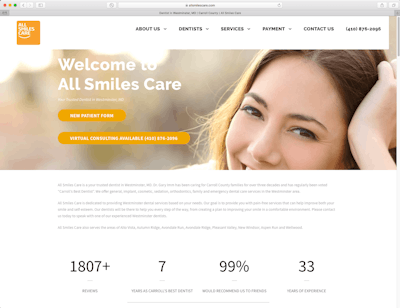
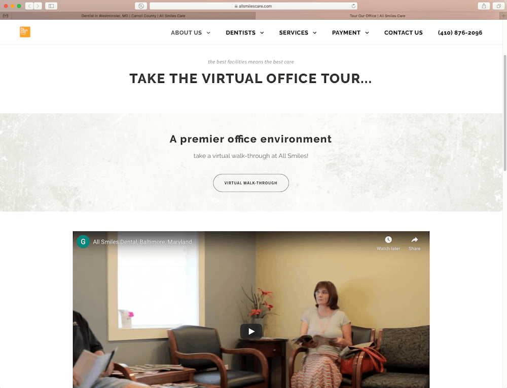
Dr. Gary Imm, allsmilescare.com


Developer: Go Fish Digital
What Dr. Imm says about the website: “Our website is a 24/7 team member that presents "our story" and interacts with our guests, serving as their guide. The goal is to not just give them information, but to quickly help them see a way to solve their problem. The next step is to add interactive whiteboards to answer patient questions. We get 35% of our new guests directly from the site and at least 95% visit it prior to coming in.”
What we like: This clean site makes it easy for patients to find the information they need and even lists the reasons they should choose Dr. Imm’s practice. And visitors can take a tour of the office from their couch. Check out Dr. Imm’s virtual office tour HERE.
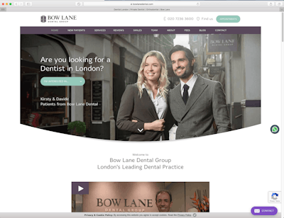
Dr. James Goolnik, bowlanedental.com


Developer: Dental Focus
What Dr. Goolnik has to say about the website: “Fun, informative and highly converting website.”
What we like: Visitors are greeted by real smiling patients, videos from the doctor and an oral survival guide they can download. Dr. Goolnik’s website also features a blog that is frequently updated and focuses on topics relevant to dental patients.
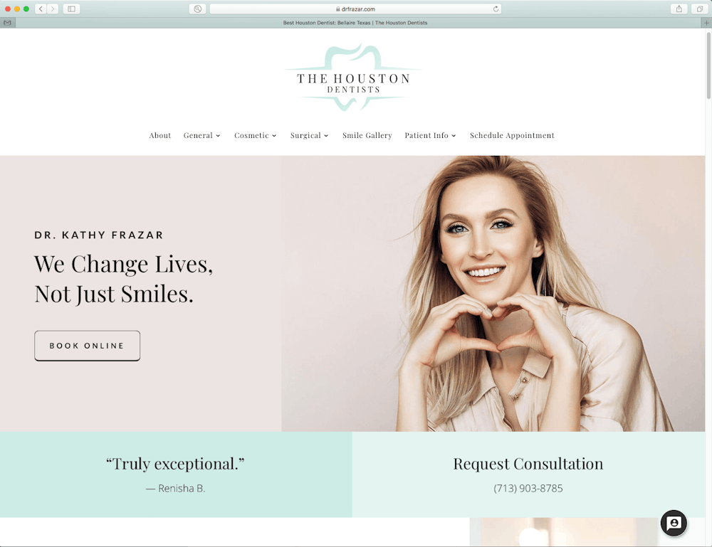
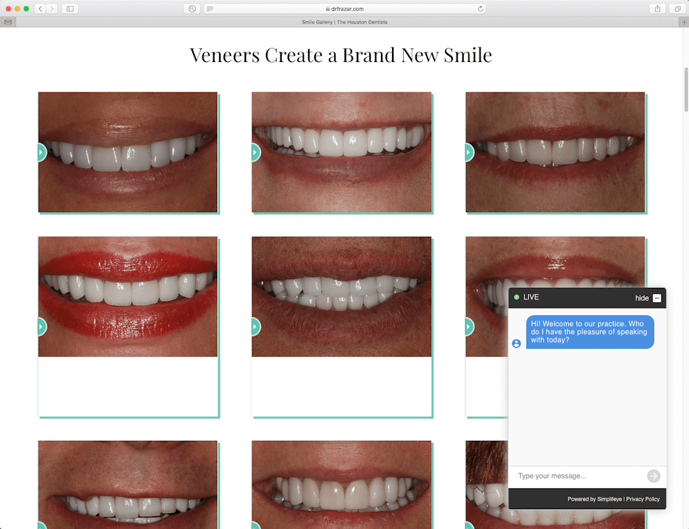
Dr. Kathy Frazar, drfrazar.com/smile-gallery

Developer: Delmain
What Dr. Frazar says about the website: “After having my old site for over 10 years, I made the decision to upgrade and update my online presence. A website must give the same feeling and vibe as your practice does. It must reflect the type of practice and the kind of care you provide.”
What we like: The smile gallery lets visitors see Dr. Frazar’s work, and there’s also plenty of information about the team, services provided and financing. The live chat box makes it easy for patients to communicate with the practice and get their questions answered right away.
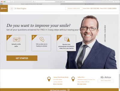
Dr. Mark Hughes, drmarkhughes.co.uk


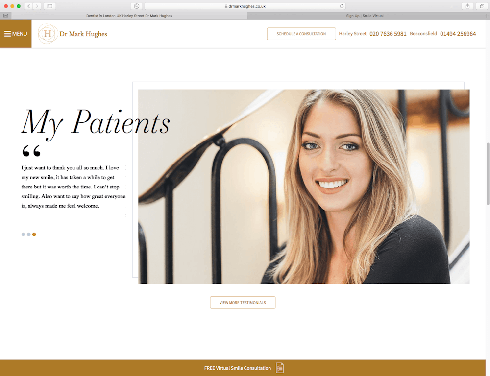
Developers: Original design by Rosemont Media, further design work by The Fresh UK. Professional photography by Chris Harris.
What Dr. Hughes says about the website: “The website helps me enormously as it showcases in a very attractive and interactive way (via the slide feature with before/after cases) many of the cosmetic smile makeover cases I have completed. It’s also designed to be quite personal. I try to show my personality in photos of me and I showcase real patients instead of using stock photography models. In essence, it is a showcase of my work and my career. The virtual consult feature is very popular and allows patients the chance to virtually meet me and get some feedback on their options before committing to an actual visit. This is proving to be particularly effective during the COVID-19 crisis.”
What we like: After reading testimonials and learning about Dr. Hughes on this easy-to-navigate website, patients can easily receive a free virtual consult just by uploading a selfie of their smile and writing a few lines about what they’re hoping to achieve.
Dr. Parag Kachalia, sanramondentist.net


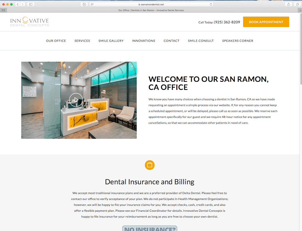
Developer: Searchlight Solutions
What Dr. Kachalia says about the website: “Authenticity is what resonates with individuals today and not cookie cutter or template based digital marketing. It is this authenticity piece that Searchlight Solutions focused on when creating the layout and displaying the visual experience for visitors. This is true both on mobile and desktop platforms. We were tired of the generic web pages we were seeing in the dental space, so we looked for a company that understands customer engagement. We also wanted a company that understands the backbone of a website in terms of performance. Searchlight Solutions is essentially the primary marketing arm of my practice. They provide a monthly report on the performance of my site and make the necessary changes to continually drive patient engagement and keep us relevant in our local geography.”
What we like: The clean design makes it easy for visitors to find what they’re looking for, whether they want to schedule an appointment or learn about the services the practice offers.
Dr. Pamela Ray, oakhillsperiodontics.com

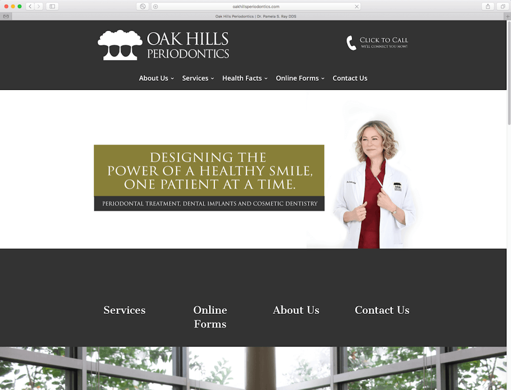

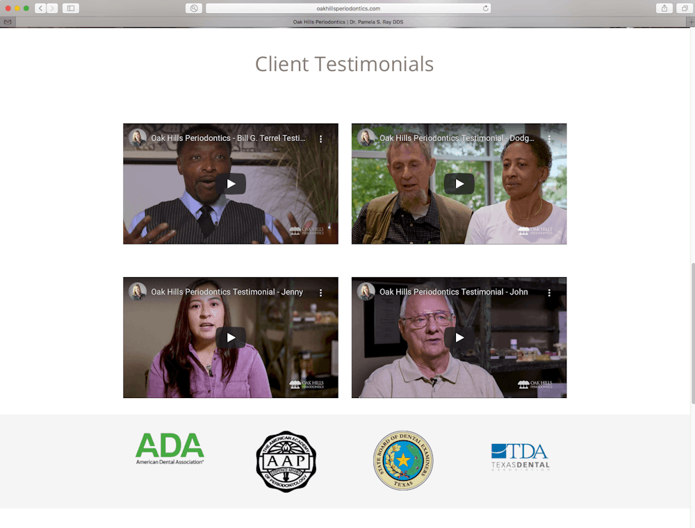
Developer: Clicta Digital and Lustrous PR
What Dr. Ray says about the website: “The website is secondary to social media and Google reviews, but once people find me through these platforms, having a navigable, friendly website is instrumental to helping them get to know me and make their way to my practice. The website serves as our digital information resource for patients and we recently added video education.”
What we like: The video patient testimonials are powerful, and the video Q&A with Dr. Ray gives a great overview of the practice philosophy while also providing patient education.
Dr. Amanda Seay, amandaseay.net


Developer: Delmain
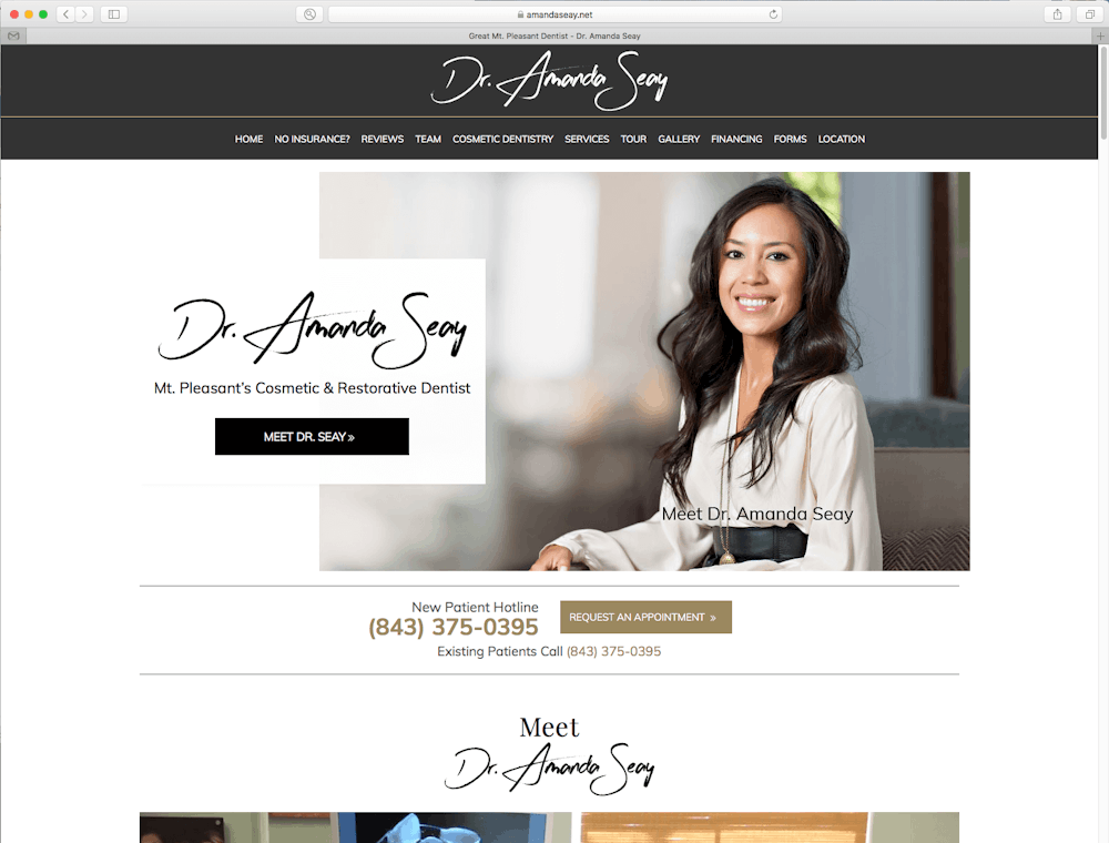
What Dr. Seay says about the website: “My website is always evolving—it must evolve to stay current! Even as it evolves, I make sure it stays clean and simple, which helps with navigability. It is user friendly for all ages and technology skills. Simple tabs at the top and contact info on the first page take visitors to specific areas of the website. In any website, performance is key; it has to do what you want it to. If someone clicks on cosmetic dentistry or before and after images, it needs to take them there and to load quickly. If visitors have to wait, they will likely exit the website and go to another.
All the clinical and portrait before and after photos on the website are of work I have done, which is something I’ve always been adamant about and take pride in. Bottom line, your website is an extension of you and your practice. People do a Google search, see I have a good review rating and hit the website to do a once over before scheduling an appointment. Traffic has been good!”
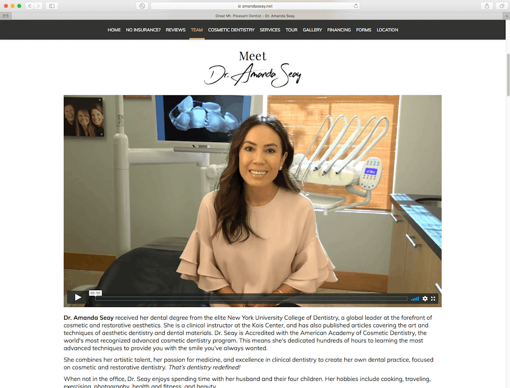
What we like: This beautifully designed, clean site has everything: videos, an office tour, patient forms, information about financing, patient testimonials, easy access to virtual consults, introductions to both Dr. Seay and the team, and before and after photos of successful cases.
Dr. Amy Creech-Gionis, tampadentalwellness.net

Developer: Einstein
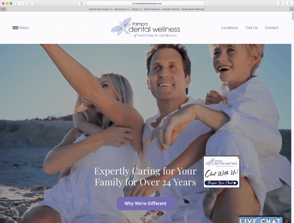
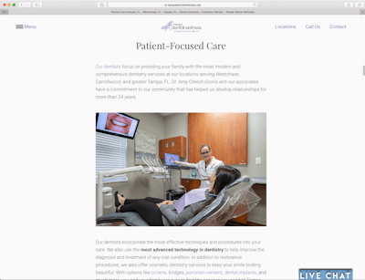
What Dr. Creech-Gionis says about the website: “Our website is essential for us. Patients use it to become informed about services we provide, to read about the team members, to access after-hours live chat, to schedule visits, to download and submit paperwork prior to coming in, and much more.”
What we like: Visitors can easily schedule online and start a live chat if they have any questions. There’s also plenty of information about services the practice offers.
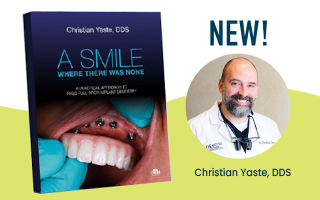
Dr. Christian Yaste, charlottedentalimplant.com

Developer: Patient Magnet System powered by Microsite
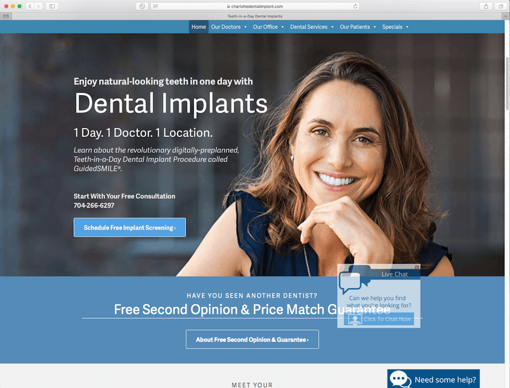
What Dr. Yaste says about the website: “Our website acts more like a piece of sophisticated software than a pretty postcard. Our online marketing is powerful.”
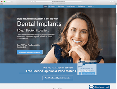
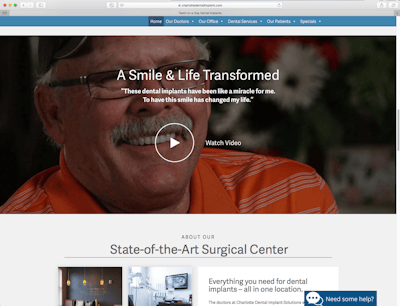
What we like: The homepage has been updated to let visitors know how the practice is responding to COVID-19, which is top of mind for everyone right now. Videos, live chat, photos of the practice and information about one-day implant dentistry treatment make the site compelling.
Dr. Maria Molano, mariamolanodds.com

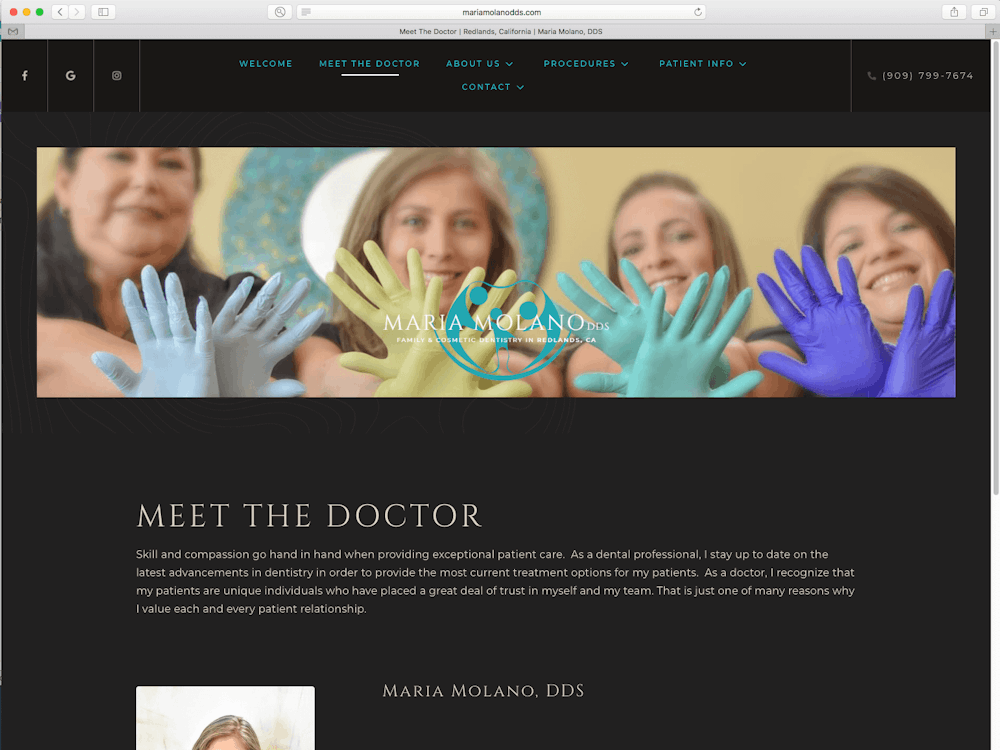
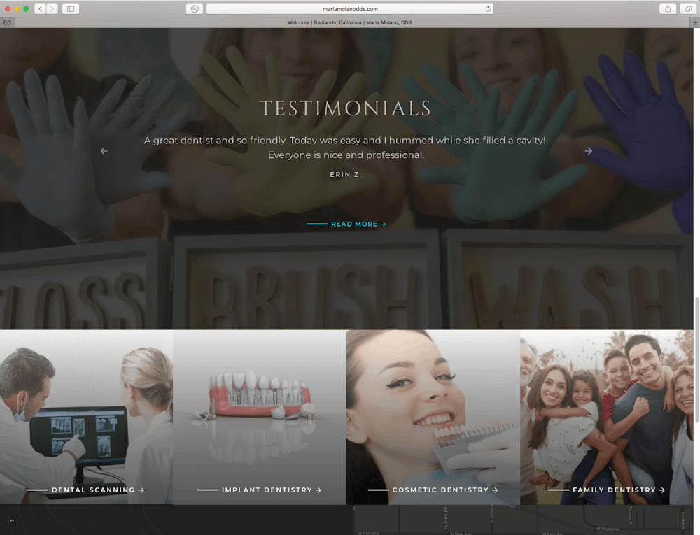
Developer: ProSites
What Dr. Molano says about the website: "Our website is light to the look, fresh and modern. It’s easy to navigate for patients of all ages and gives visitors all the information they need about our practice. The website is welcoming, makes it easy for patients to schedule appointments and has a very personable design."
What we like: This website makes you feel like you’re already at the practice. There’s a new patient information center and tons of videos about the office as well as various dental procedures.
Now let’s talk about your website
Considering making updates to your website? Think about the adjustments you can make to improve the user experience and encourage more visitors to contact your practice. You can start incorporating changes now to help improve patient flow once you’re back in the office.
 By: The New Dentist
