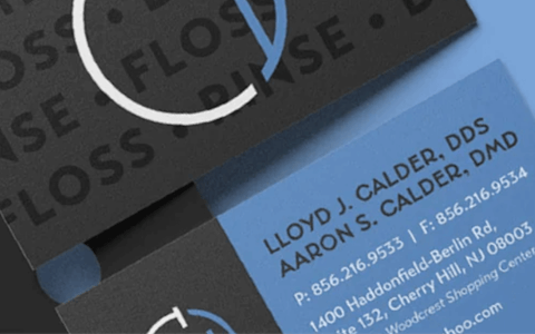
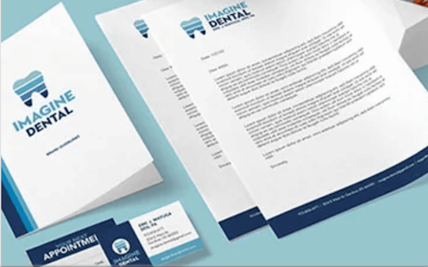
TODAY’S GIG ECONOMY has spawned numerous options for business owners who simply want logos designed fast and cheap. But your brand is so much more than just a logo, says Allison Simenkiewicz, a graphic designer by trade whose full-time job is carefully crafting brand identities for dental practice owners nationwide. A critical part of that work involves guiding her clients through a process that ensures their visual identities aren’t merely representative of their own philosophies, but also an honest promise about the patient experience. “Branding is very personal, so it’s a lot of emotional stuff. If it just feels right, it probably is right,” she says.
Unlike online logo factories that churn out cookie-cutter designs by the bucketful, Simenkiewicz says there’s no substitute for personal, in-depth conversation and discovery. “It’s a search for inspiration, really. Sometimes it starts with the doctors, who bring examples of brands they like to the initial meeting. Other times, clients look to me to help jump-start their thinking with me asking questions.”
Because Simenkiewicz is part of Benco Dental’s interior design team, her work is sometimes an organic outgrowth of bringing a doctor’s complete practice vision to life. “As part of the interior design process, our designers assemble mood boards—idea collages—based on each client’s individuality and vibe.” The mood boards aren’t just helpful as inspiration for logo creation but also as a means for selecting visual brand elements to integrate throughout the entire facility.
However, Simenkiewicz stresses that there’s no right or wrong path, nor any particular ideal circumstance for creating (or updating) your practice logo. Far more important is that the final product works for you, not against you. “I’ve seen overly sleek logos come off as cold and off-putting, but at the same time, it’s a delicate balance to look friendly and inviting as a health care professional,” she says.
Likewise, there are a variety of practical considerations that need to be addressed early. “You don’t want to order building signage or lab coats and find out that the logo is unusable for technical reasons,” Simenkiewicz says. “Then you end up altering it to suit the medium, which dilutes your brand consistency. Your logo should work equally well on a social media post or website as it does on a wall in your office.” What does that look like in practice? Get a feel for everything that Benco Dental's exclusive CenterPoint design and equipment showrooms have to offer, and meet our team of designers.
With the right designer, expressing your brand visually can be fun and fulfilling and, ultimately, rewarding. The finished product can serve as both a marketing tool and a point of personal pride. “Everyone gets excited about branding because it’s your voice out in the world,” Simenkiewicz says. “I’m lucky that I get to help doctors channel that and show it off.”
CASE STUDY #1:
NEWARK DENTAL
MANY PRACTICE OWNERS are intimidated by the idea of commissioning and selecting a logo. After all, as the primary visual representation of your brand, it needs to communicate a lot of things about you—at a glance. No wonder so many put it off, and off, and off . . . while, in the meantime, their marketing and public image suffers. But you don’t necessarily need to enter the process with strong ideas to achieve a great result you’ll be confident about.
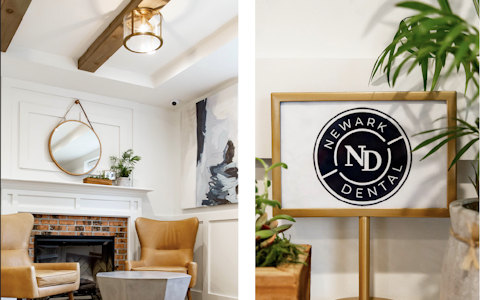
Case in point: Newark Dental, an upscale practice with a small-town vibe, named after its Ohio location about a half-hour east of Columbus. As part of a recent relocation, it moved just up the road from its previous home to a larger, but slightly stodgy, building that formerly housed a physician’s health system branch. Despite its plain bones, Newark’s team did a brilliant job of brightening the space by allowing in plenty of natural light, while mixing whites and light colors with accents of earth tones and natural textures. The result is warm and unpretentious but sleek and professional.
Newark brought on Benco Dental’s Build Your Brand team to create a harmonious visual identity that melded their new office design with their existing brand equity in the community. “They came in without specific ideas,” says Simenkiewicz, the who led the design work. “But they communicated a general preference for contemporary design and a great deal of affection for the town, so that was a good jumping-off point.”
The first ideas incorporated natural elements from Ohio’s state tree (the buckeye) as well as a nearby river represented in the logo by chevrons, with additional abstract cues hinting at a fireplace. None hit the mark, but they got the Newark team thinking about a current town-wide improvement project and how they might carry its most familiar elements (like wrought-iron fencing) into the logo.
“That inspired us to think about lasting quality and solidity. We found the best way to telegraph that was to create the logo in the form of a seal, like you’d find embossed on fine leather or stamped into metal,” Simenkiewicz says. “We used bold lines that distantly echo the arches of the mouth, and if you squint really hard, they even suggest a dental impression.”
Donna Wheeler-Hunt, the practice’s office manager, served as point person for the project. “It was essential that the outcome was timeless and meaningful. The logo needed to express who we are and what we do,” she says. “The team worked to tweak the images until we were satisfied. The result was perfect. It says what we do and what we are building: everyday, hometown trust.”
Want to see more case studies? Browse Benco Dental's Build Your Brand gallery, or start a conversationwith one of Benco Dental's brand designers to craft your own unique identity.
CASE STUDY #2:
NORTHWEST ENDODONTICS
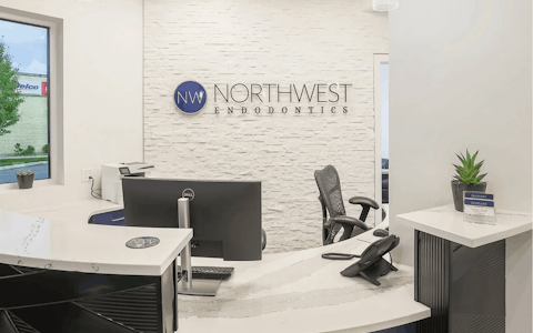
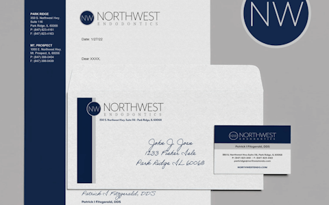
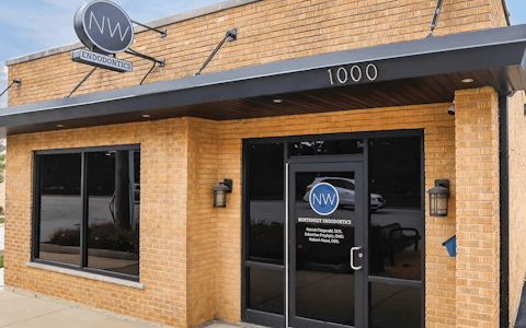
BUYING TWO legacy practices and transforming them into something uniquely yours would be a challenge under any circumstances. Dr. Patrick Fitzgerald had already accomplished that with two locations in the northwest Chicago suburbs when the opportunity arose for a more dramatic image overhaul. After considering building from scratch to replace his Mt. Prospect, Illinois, office—a daunting task in a major metro where lot inventory is virtually nonexistent—he finally found the ideal existing structure with a perfect amount of square footage to support his vision.
“My two locations were started by separate doctors decades ago. In fact, they’re two of the oldest practices in the Midwest. But they needed to be unified, branded together,” Dr. Fitzgerald explains. “The logo and brand identity had to be reflective of both what we do as a specialist and who I am as an individual. It needed to be clean, precise and have symmetry.”
Overseeing the design of a new location from a clean sheet of paper can be overwhelming, but even more so when combined with the simultaneous challenge of imposing brand symmetry across multiple offices. However, Dr. Fitzgerald is the first to admit that this is an area in which he thrives. “My mind does not rest unless there is order. My wife will laugh when she reads this. That’s how I’m wired. It drives my daughters crazy.”
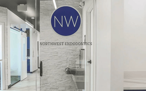
He brought to the table a distinct vision for how his brand would integrate with the practice’s design and interior. In short, it had to “resonate cleanliness, with an aesthetic that looks modern,” he says. Because clinical innovation is one of his practice’s key drivers, Dr. Fitzgerald insisted that all elements coalesce into a smart, cohesive whole that would help inform the total treatment experience without being stiff or unfriendly. If that sounds uncompromising, it is, on purpose. It’s at the heart of how the doctor delivers care: “A seamless treatment experience,” he calls it. “One my patients tend to value.”
Helping execute that vision fell to Emily Pieshefski and Sharon Fiorini of Benco Dental, along with Dr. Fitzgerald’s contractor, Andrews Construction. Pieshefski, an interior designer, recalls that the doctor made the process simple because “he had a really good sense of what he did and didn’t like, which made homing in on his style and then pulling together finishes an easy process. We started out with a sleek and sophisticated black, white and gray palette, but then added in the touches of blue from his logo throughout his space to really tie in his brand.”
Meanwhile, Fiorini, a branding and graphic design expert with more than 30 years of experience, worked directly with the doctor through several rounds of logo development. “I started with some ideas based on his mood boards,” she says. “Once we met, he conveyed that he wanted a design that is super-clean, modern, upscale and minimal.”
It helps that Dr. Fitzgerald has a keen sense of what his patients expect—and he’s candid about where he misjudged those expectations earlier in his career. Back then, he says, he didn’t want patients to get the impression that his care might be out of their financial reach. “I was wrong. Thousands of patients were ecstatic with their treatment. It made me so happy to hear. My hindsight wishes I would have approached the concept differently when the Park Ridge location was created.”
If this is a do-over of sorts, Dr. Fitzgerald has done it with precision, clarity and deftness that succeeds in mirroring his clinical philosophy. “I feel patients deserve the setting we created in Mt. Prospect, not just amid treatment. It truly provides the impression that we are going to convey something superior.”

Excerpted from Incisal Edge, Benco Dental's multiple award-winning magazine covering strategies for business, clinical and personal success. Visit IncisalEdgeMagazine.com for regular features on how practices nationwide are employing sharp branding to boost their images and recognition—and how to apply creative ideas like theirs in your own practice. Check out the latest issue and subscribe to the print edition.
BENCO DENTAL IS THE LEADER in cutting-edge dental practice theory, consulting, systems and design. They drive dentistry forward through their innovative solutions and caring family culture. The company is also the country’s largest independent distributor of technology, equipment and supplies with 1,400 associates across the U.S.
