Time and again, dentistry has proven itself to be reasonably recession-proof. That doesn't, however, make doctors immune from psychological pressures like inflation, rising wage costs and student loan debt.
It can be daunting to move forward with plans for a new practice or a complete renovation during times like these. But focusing your attention and budget on one key area can make it much easier get started...especially when it will result in measurable ROI.
That's why seasoned practice designers often argue that your entryway may be the best place to concentrate on. Since it's cosmetic, not clinical, the costs are minimal compared with a total reimagining of your entire office. Yet presenting an alluring, beautiful, clearly functional entryway that clearly communicates your brand is central to getting new patients relationships off to the best possible start....and reinforcing prior positive impressions.
The Psychology of First Impressions
Whether you recall a certain experience from your past as blissful or disappointing, you likely remember minute details about it. Psychology Today explains this as your brain taking “first-impression Polaroids that form an impression larger than their sum” and “capture elements of truth.”
Interiors expert Sucharita Ray, director of design for Benco Dental, explores the look of three practices, focusing on the entryway—that crucial initial glimpse. “Research shows it takes less than 10 seconds to form a first impression,” Ray says. “In a dental practice, that impression would be what visitors see from the front door, the parking lot or, in the case of a potential patient, even from the street. In most cases, even if your service is impeccable and you’re well-seasoned in your craft, patients’ first impression stays with them.”
Her guidance for dentists: Align your own first impression to be consistent with your practice values, vibe and the patient base you aim to attract. Ray—known informally as “Suchi”—explores the elements that accomplish all this, as well as three examples of well-designed entryways.
Instant Karma
Five ideas for creating a positive first impression.
#1: Feature your logo where it will be seen upon entry. If a new patient has noticed your logo on your website or outdoor signage and recognizes it when they walk in, it reinforces that they’re in the right place.
#2: Denote a clear entry point for visitors as soon as they walk through the door. A greeter or simply an intuitive pathway should direct them to sign in. Some patients, if they’re unsure of where they ought to go, will consider the practice poorly run and leave.
#3: Create several seating pods if your space allows. (Insider tip: Use the same chairs, but with varied upholstery.) Establish zones that are family-friendly or adult-friendly so patients, especially those with social anxieties, don’t feel forced to sit next to a stranger. Imagine an introvert seated next to someone prone to asking personal questions.
#4: Offer beverage service, keeping in mind CDC guidelines. One idea: a simple concierge service at sign-in, such as an offer of water or soda by front-desk personnel.
#5: Install acoustic treatments over the front desk so check-in conversations can’t be heard by others in the reception area. Consider piped-in music, overhead white noise or architectural elements such as a drop-down soffit, acoustical tile or paneling.
Example #1
Dental Utopia
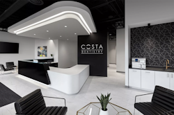
Costa Dentistry
Great Falls, Virginia
“I wanted to create a space that sets us apart,” said Dr. Thomas Costa. “The dentist isn’t anyone’s first-choice destination, so I wanted a place that’s interesting to visit and comfortable.”
The reception area is well thought-out, from the different types of lighting that add interest to the black walk-off carpet in the front-desk area that restricts outside elements from soiling the white floors.

“We installed the highest-quality air filters and sanitation systems,” he continues, “and designed the flow of the office to allow more space for people to spread out.”
It all starts, of course, in the welcome area upfront. Dr. Costa describes the vibe as “spa-like,” intended to make patients “more relaxed the moment they step in. The serene, clean, modern design lends a calming effect.”
Dr. Costa has received a number of industry accolades, such as inclusion in the 2015 Incisal Edge 40 Under 40. Yet he’s quick to extol the talents of those around him, from his design team to his colleagues at the practice. “I was fortunate to work with architects and designers who truly understood my vision and my taste in design,” he says. “I knew what they wanted, and they made it happen.”
Design Tip!
"Follow your vision. Stick with the plan. Dentistry has overcome two major health crises, HIV and Covid-19. If you can gain patient trust by creating a safe environment, the sky’s the limit.” —Dr. Shane Costa
Example #2
Shell Game
Brand Dental
Kingston, Pennsylvania
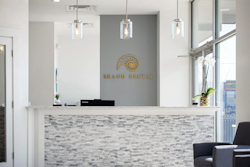
Beauty, sacred geometry, grace amid growth: All are attributes of the exquisite nautilus sea creature. For one dental team, the nautilus “set the tone for every sequential step in the design process” of Dr. Stephen Brand’s new office.
The nautilus shell is an example of the ‘Golden Proportion,’” he says. “Nature repeats this ratio in sunflowers, your fingerprint, DNA and the spiral shapes of galaxies. It also does so with the human smile. I use [the proportion] every time I do a cosmetic case to make sure my results are in perfect harmony with the rest of the body.”

The theme, Dr. Brand says, is “modern coastal,” a nod to time spent in Charleston, South Carolina, when he was chief resident of the Medical University of South Carolina’s AEGD program. “Ultimately, what makes the space work is the square footage,” he observes. “Nothing feels cramped. And patients comment on how comfortable our reception made them feel, how their anxiety went down.”
The hue palette fell into place after the selection of the nautilus. “Colors have many effects on patients’ subconscious,” he says. “We chose mainly grays and whites for flooring, walls and cabinetry, then blues and greens as an accent color.”
Artisan cabinets from Midmark and quartz countertops, Dr. Brand notes, offered upgrades that fit within their preferred color range. Full-spectrum LEDs helped compensate for limitations in natural light, and they use an Amazon Alexa digital assistant as an intercom of sorts “when we need a treatment plan or a patient is ready to be seen.” It all comes together in sacred geometry and Golden Proportions of its own. The nautilus, keeping silent sentry from above the reception desk, no doubt approves.
Design Tip!
"Be as involved in the construction process as possible. There’s often miscommunication between the architectural plans and the contractor, so it’s important to be there to answer questions. It can be minor, such as not having a power outlet where you need it, or something major, such as the flooring pattern or ceiling type.” —Dr. Stephen Brand
Example #3
Spa Session
Charlestown Dental
Malvern, Pennsylvania
Dr. Palak Jain describes her personal design sensibility as “simple sophistication,” and the entry of her Philadelphia-area practice reflects it.
“Our inspiration for the construction and design was based on the realization that people dread going to dental offices, and we wanted to change that notion—both from the facility and the personnel perspective,” Dr. Jain says of the 1,500-square-foot space. “We wanted patients to feel welcome and comfortable as soon as they step in.”
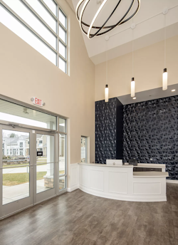
A three-dimensional accent wall is a striking feature in the entry area as well. “We wanted vibrancy and variety, not boring and mundane,” Dr. Jain says. “We wanted to build an office that had a wow factor as soon as you enter—not a spa but not a dental office, either. Something of a hybrid.”
Natural light streaming in creates a warm, welcoming space that’s relaxing for a reception area. That combined with the high ceilings eliminates the need for artwork.

If patient happiness ensues, well, the aesthetics of the place—augmented by team excellence—are doing their job. “The most important contribution to a first impression is the overall patient experience, from the first phone call to the post-visit follow-up,” Dr. Jain says. “We have a tremendous staff that goes above and beyond to meet patients’ needs and make them feel welcome and valued.”
Design Tip!
"Always use a contractor who has experience with dental-office construction. A general contractor is not a good choice. Make sure your equipment rep and contractor communicate; you’ll suffer if they don’t. And work within your budget—it’s extremely easy to overshoot without planning.” —Dr. Palak Jain


